Before And After
Interior Design Transformations in San Diego, Solana Beach and beyond: See the Difference!
Experience the power of transformation with Charles Taylor Interior Design. We proudly serve the greater San Diego area, specializing in dramatic makeovers for homes and businesses in Solana Beach, CA, and beyond. Our passion for design and unwavering commitment to client satisfaction turn ordinary spaces into extraordinary havens.
Explore our before and after portfolio of incredible transformations and see the difference our interior design expertise can make in your space. Let us reimagine your property and create a before-and-after story that truly reflects your unique style and vision. Schedule your consultation with Charles Taylor today!
Contemporary Before and After
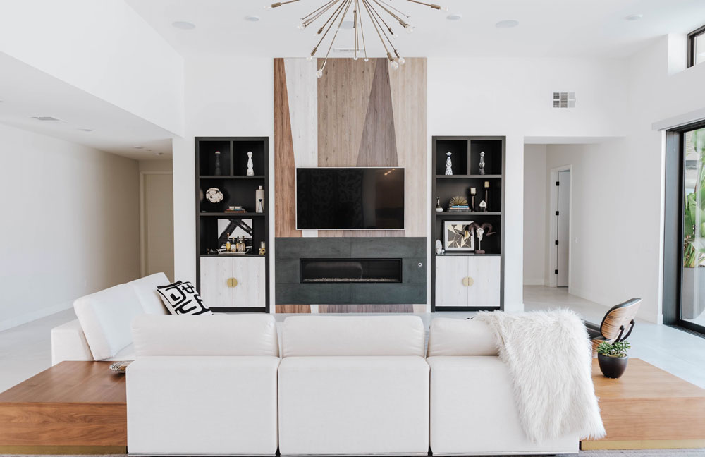
Living Room
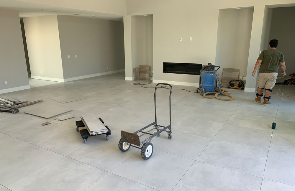
This was a new construction project, and we assisted the owners through the design and build process from the ground up. We ensured that all the architectural finishes worked with our design direction. The goal of this space was to create a fireplace wall that did most of the heavy lifting, design-wise. The combination of wood veneer styles/colors brought in a warmer material but stayed true to the contemporary edge the client wanted. Clean lines and a spartan style was the goal here.
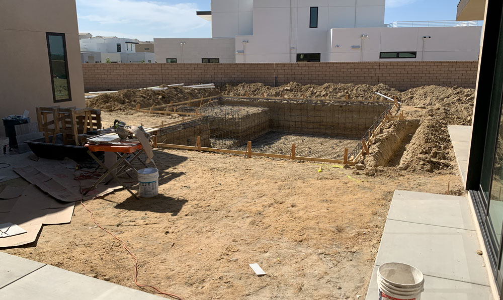
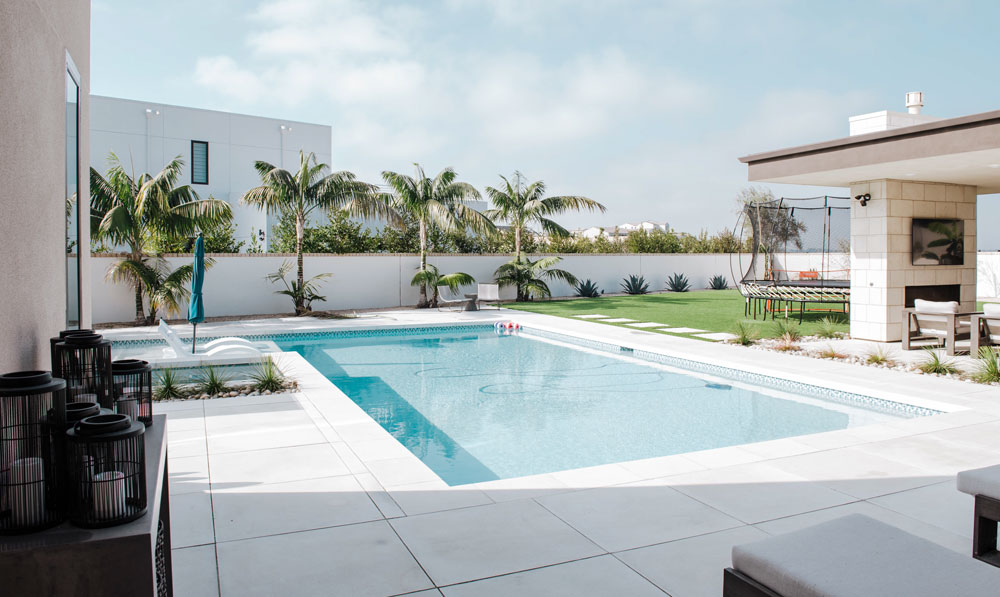
Outdoor Entertainment Area
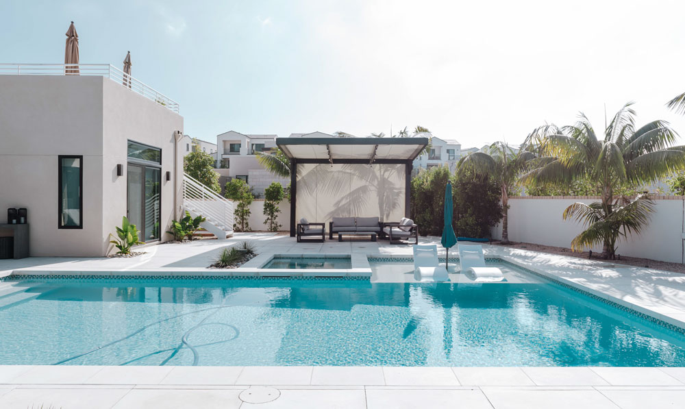
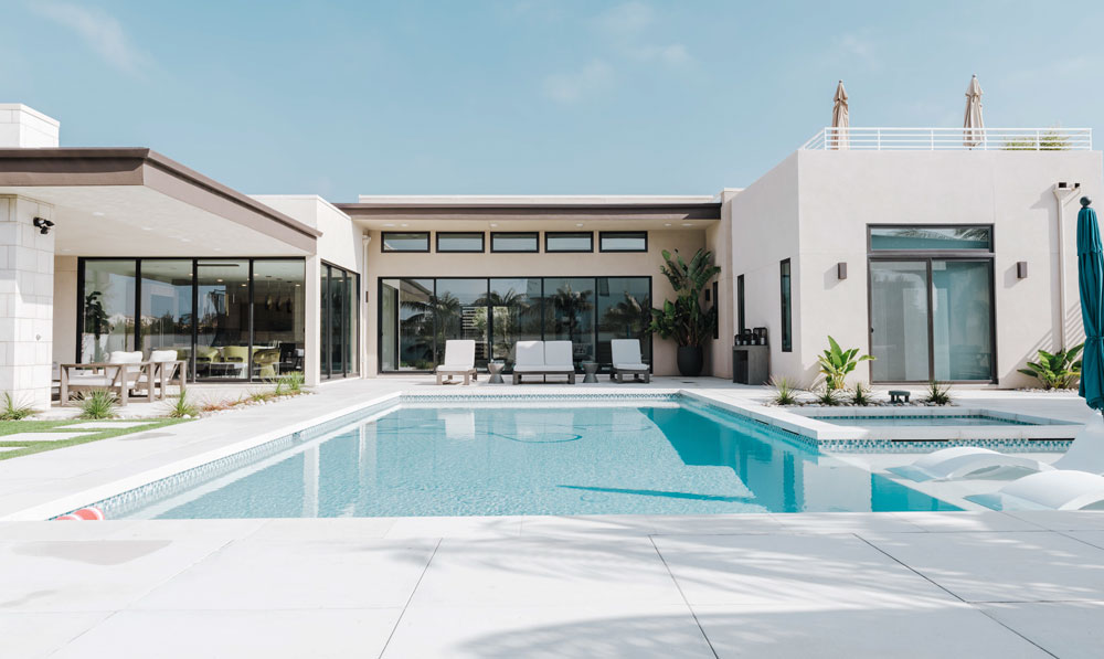
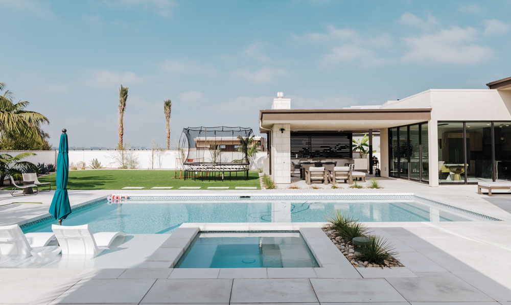
We assisted the owners with the backyard design to provide better functionality and a more appealing aesthetic.
Traditional to Transitional Before and After
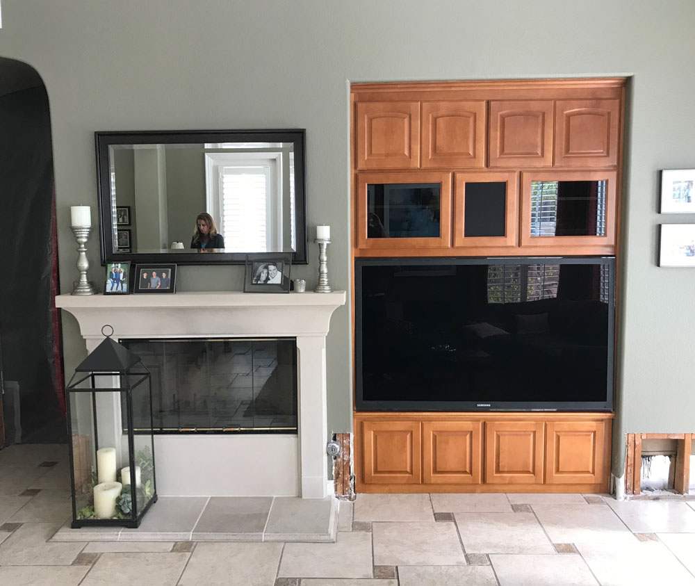
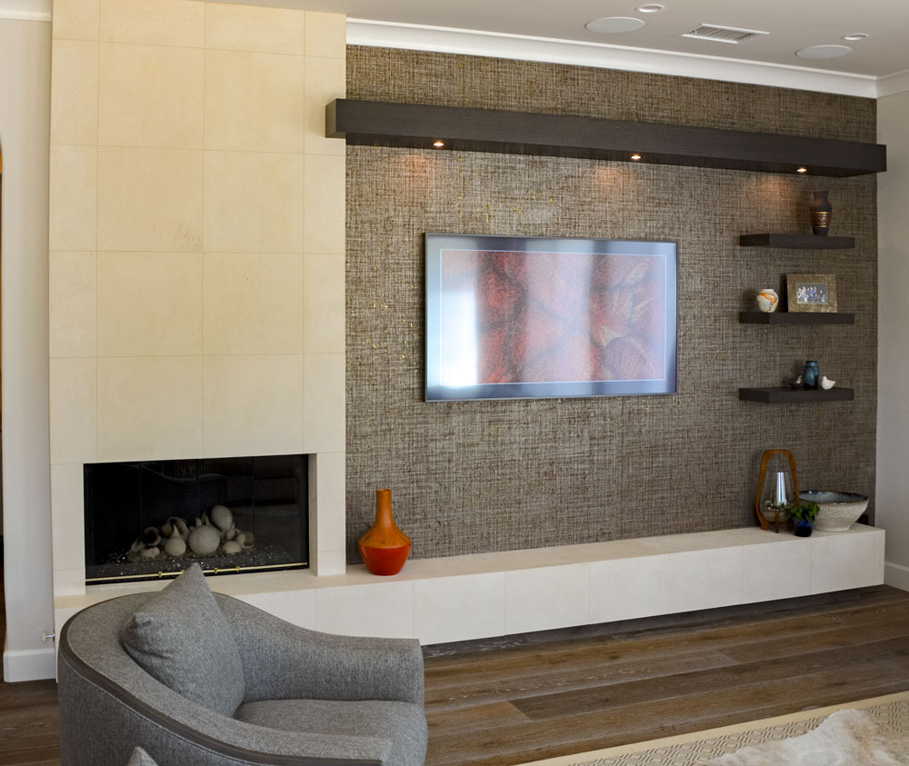
Fireplace
The client wanted a more contemporary feel in the living room and hated this dated fireplace wall. It was initially a disjointed space, so we designed something that would bring the whole room together in one piece. The Phillip Jeffries gold-backed cork wallpaper was a beautiful final layer to the space.
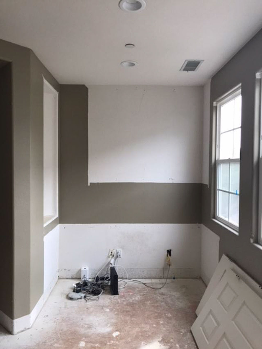
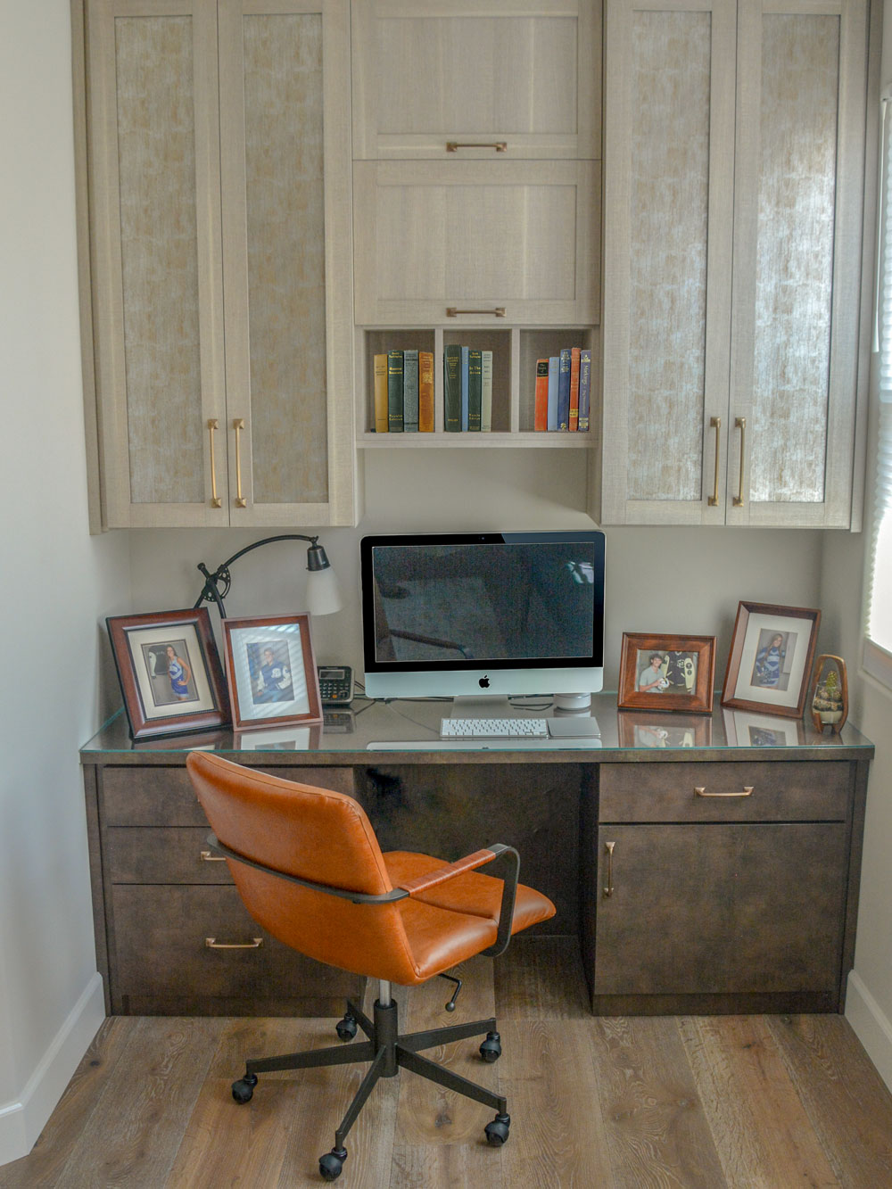
Office
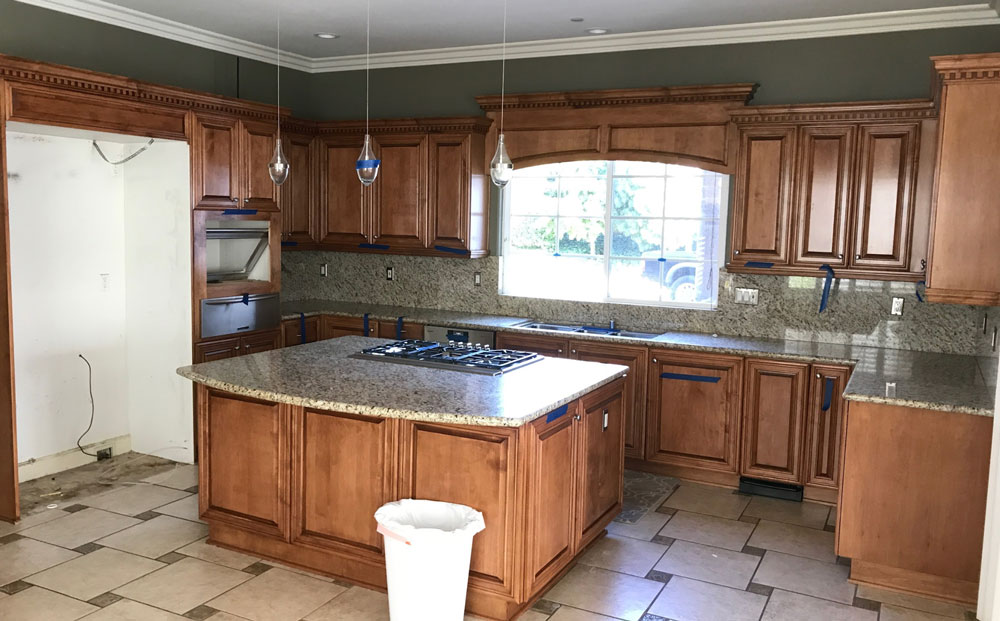
Kitchen
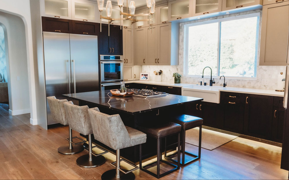
Complete kitchen overhaul that included custom cabinetry that better fit their space. We created a hidden pantry under a staircase along the right side of the kitchen that helped free up room in the main space. They wanted everything from a new steamer unit to a pebble ice maker. It’s safe to say that this ended up being a chef’s special.
Guest Room
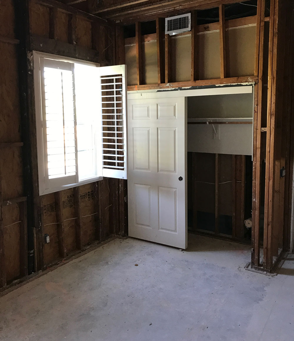
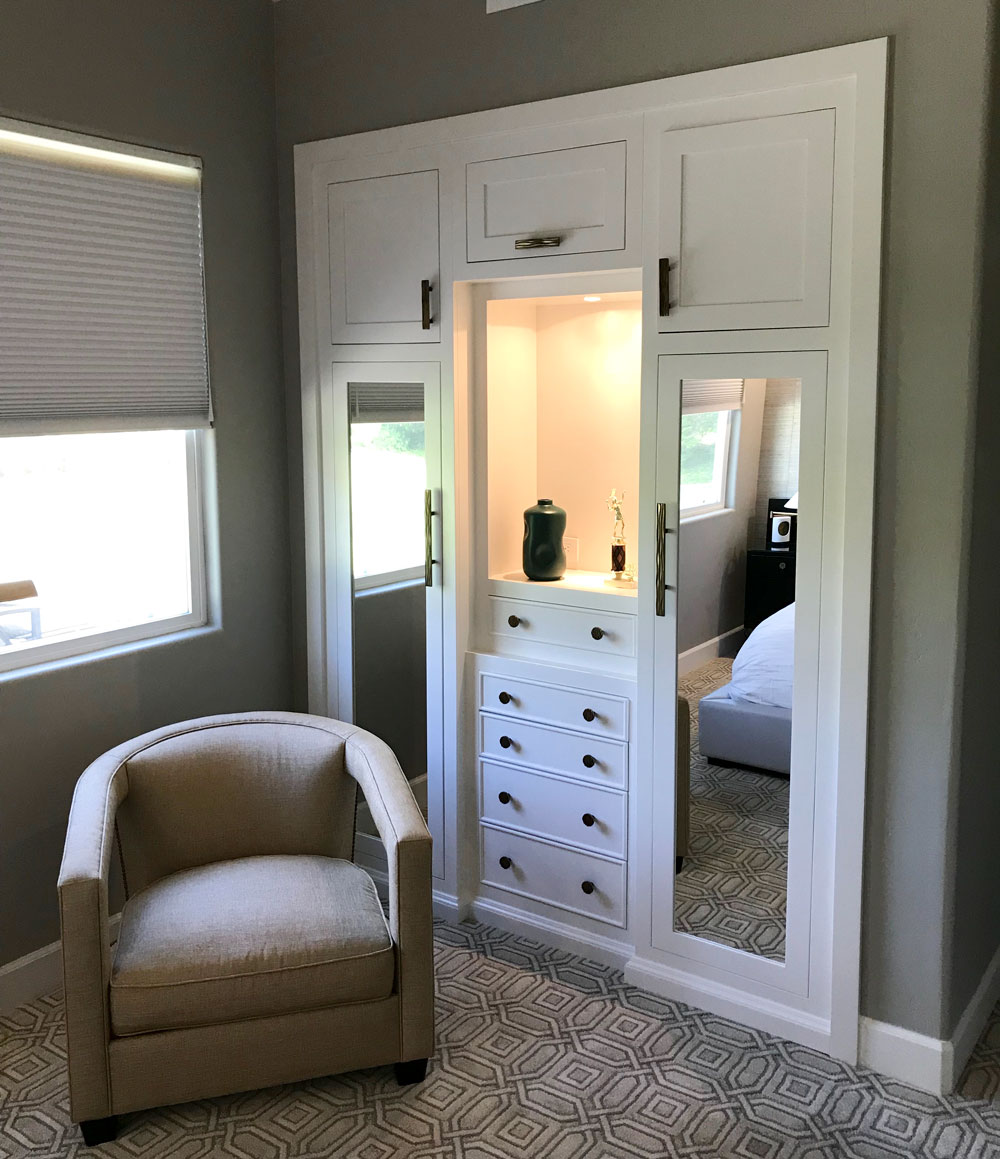
This was a guest room remodel that the client wanted to give the people staying with them more of a hotel-like feel. We demoed the reach-in closet and created more of a built-in clothing caddy. It had hanging space, drawers, shelving, and a vanity top. It was a better use of the space and gave the visitors more options for storing clothes and personal items.
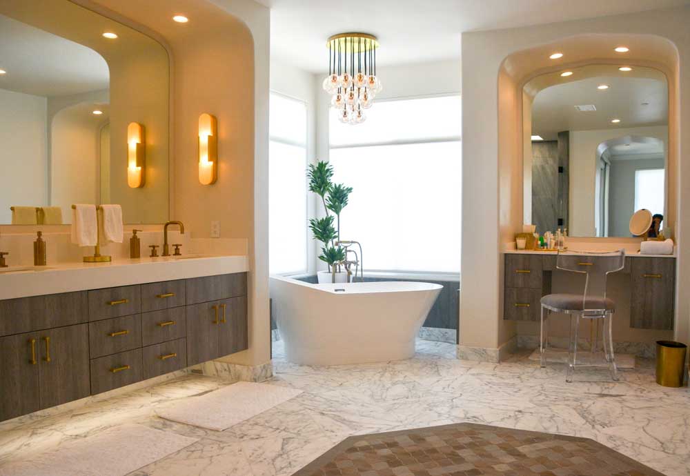
Spa
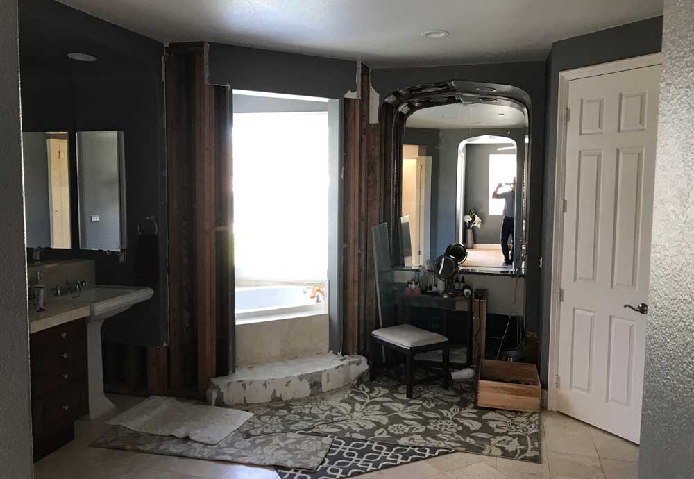
The client wanted a spa-like master bath space centered around a custom bathtub. The key to the overall design was the lighting plan that we installed. It cozied up the bathroom and made it a good soak place.
Front Door Before and After
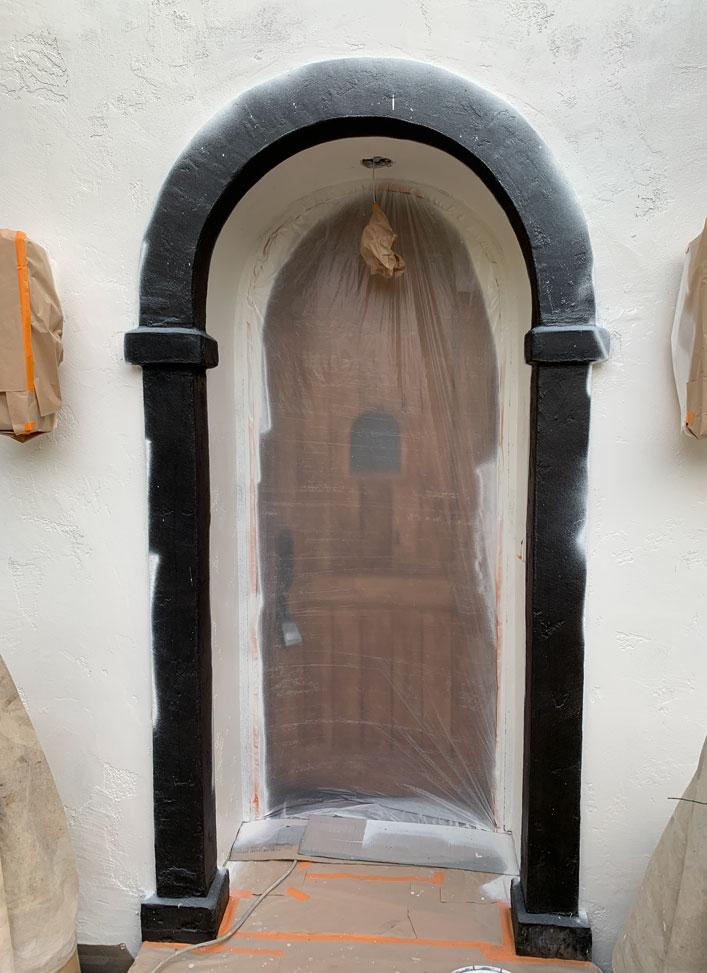
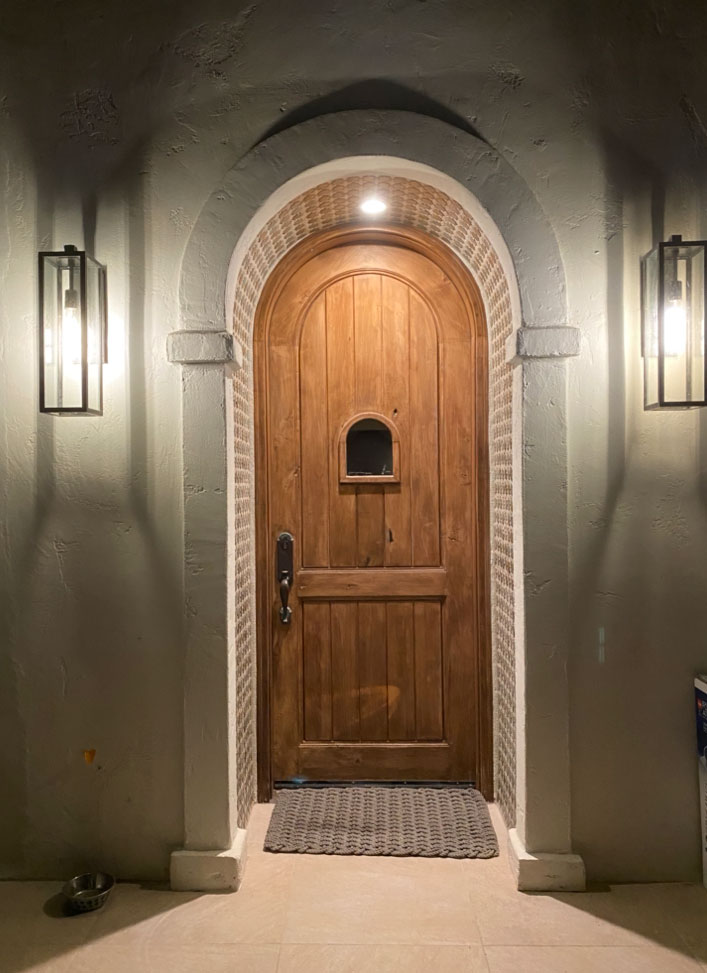
Front D
We completely remodeled this Spanish revival home on the coast in Encinitas, but my favorite part was the front door space. We made so many changes to this project that we loved. We wanted an excellent front entry space to welcome friends and family into a beautiful space.
Knife
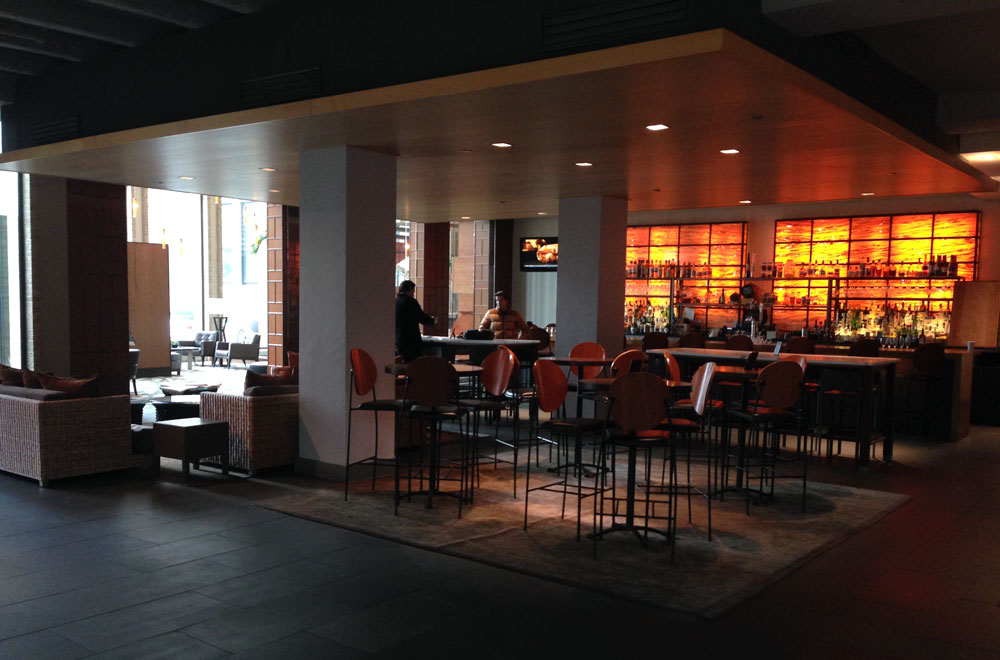
Bar
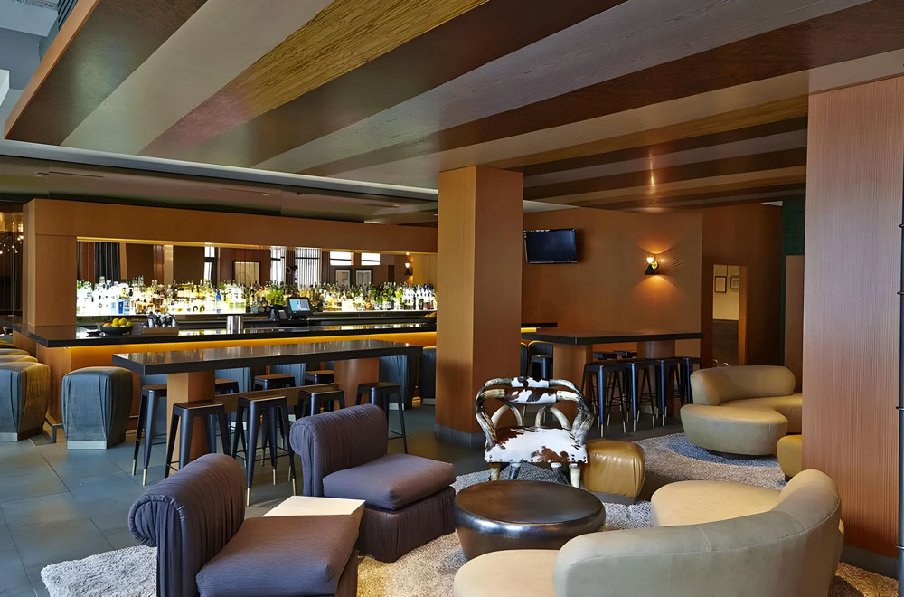
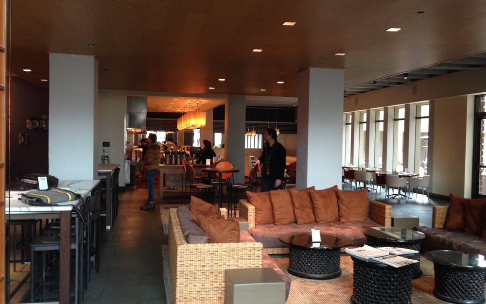
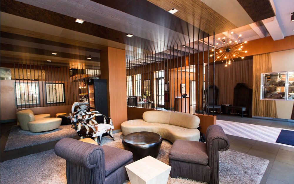
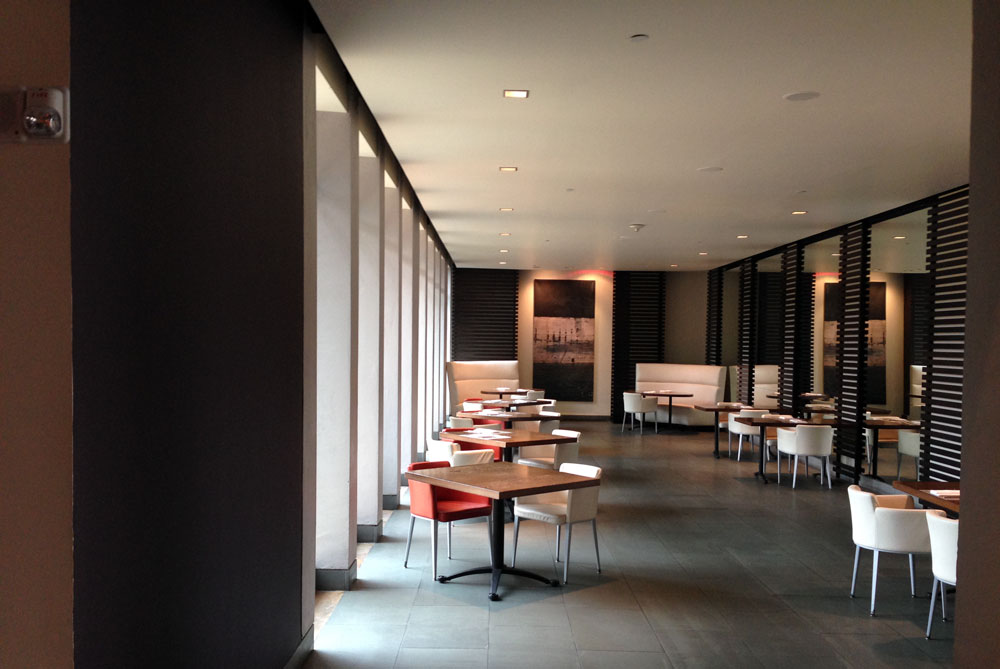
The Palomar Hotel needed some serious updating, and we were called to do just that. This is the hotel’s bar. We wanted to create a fun space that people would remember long after their visit. We created a loungy, cozy vibe with fun furniture (some bought and some custom) that created a central hub for the other parts of the hotel, which we brought into a more artistic look and feel.
Dinning Room
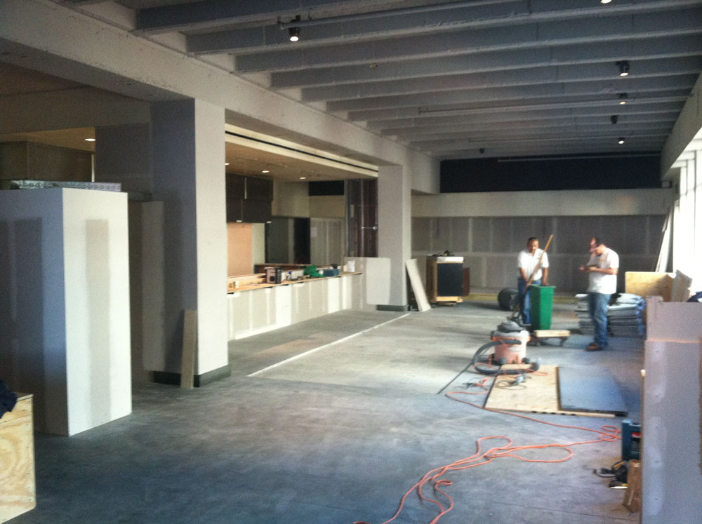
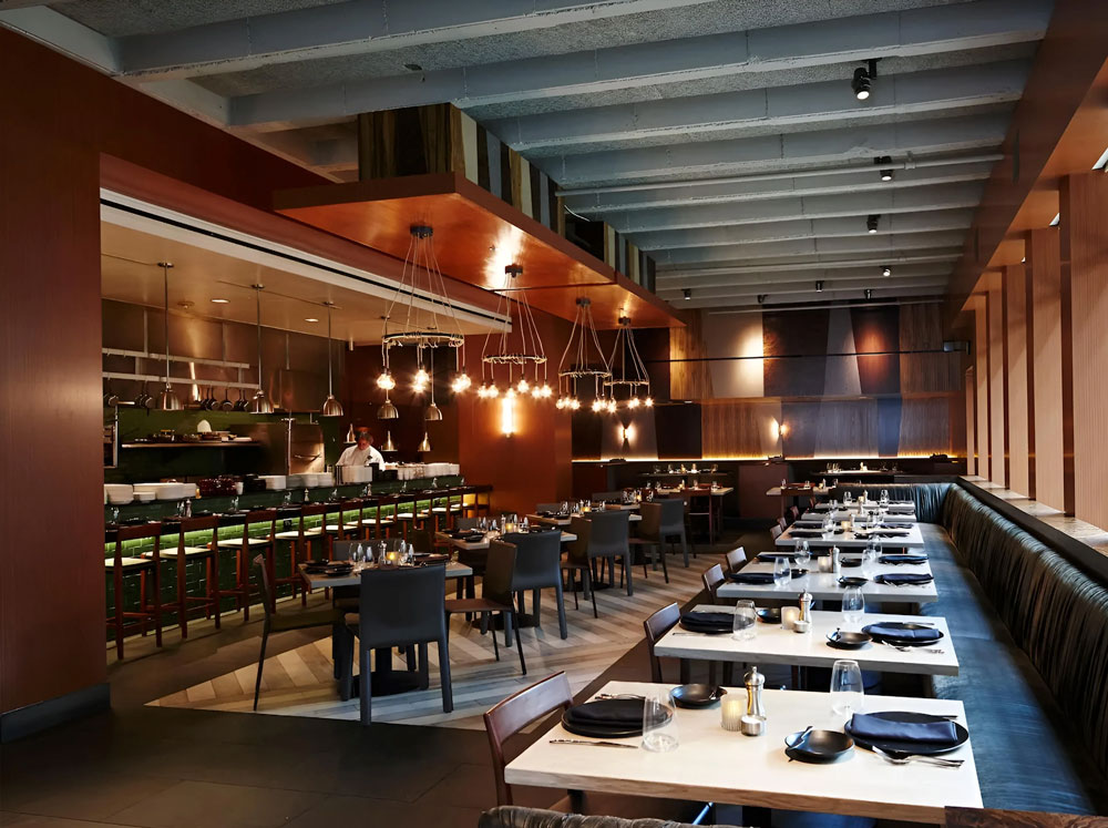
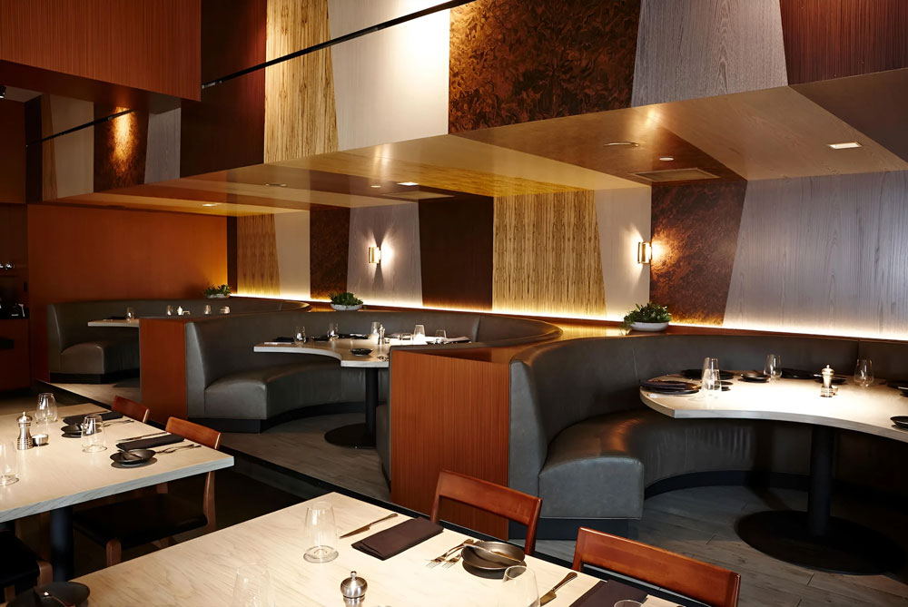
This was a restaurant project for a “Top Chef” contestant who already had a few restaurants that we had designed for him. This was to be a steakhouse, and while they wanted to break some boundaries and create new dishes with the menu, they also wanted a modern feel using classic materials. We used a ton of mixed wood veneers, stone, and tile to create a space covered in design shapes and finishes.
Spanish Revival with 2nd Story Addition
Exterior
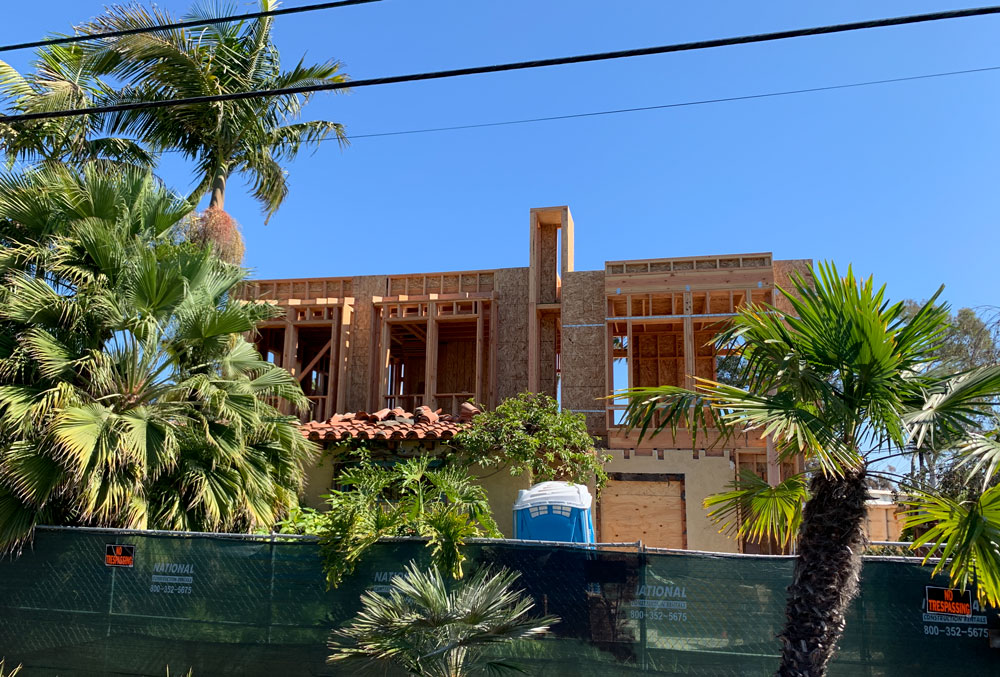
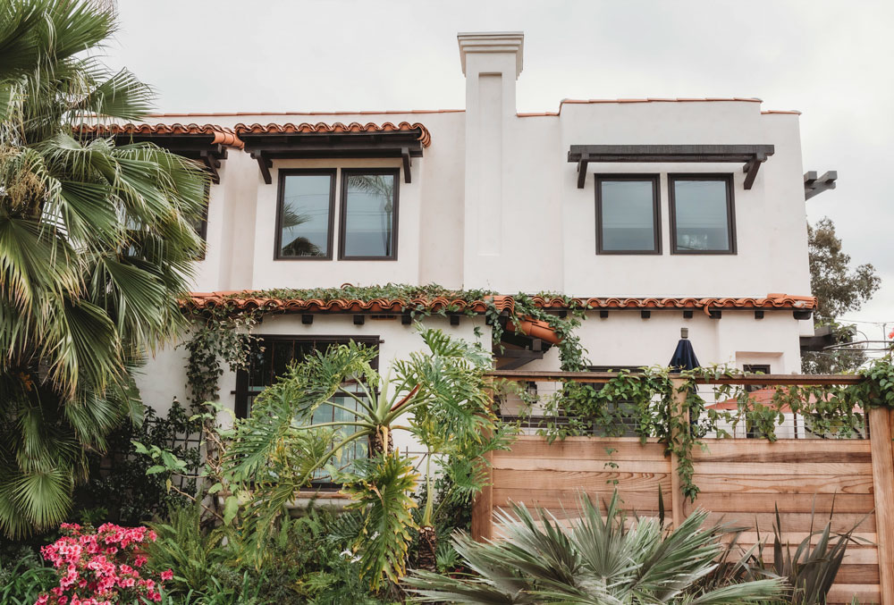
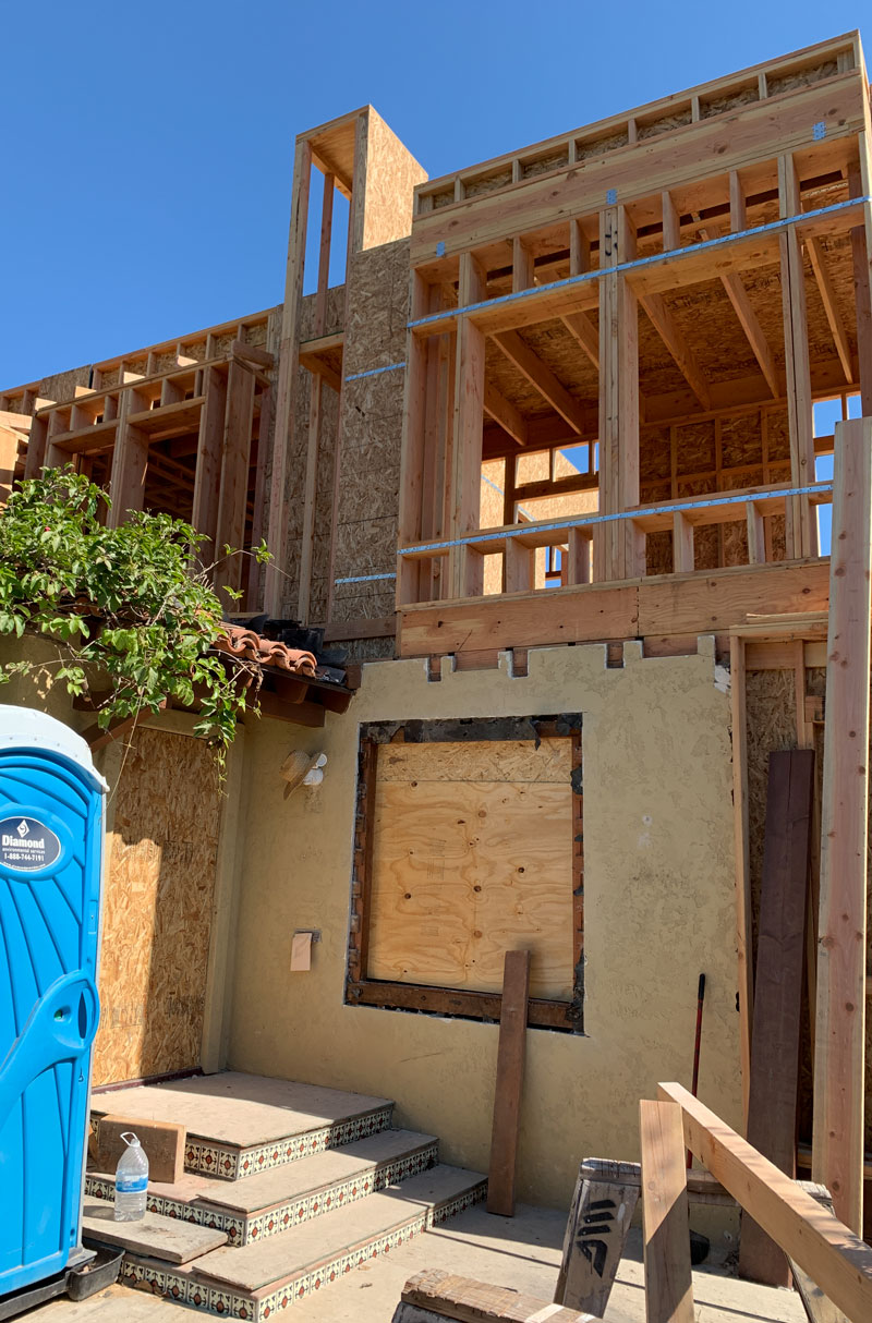
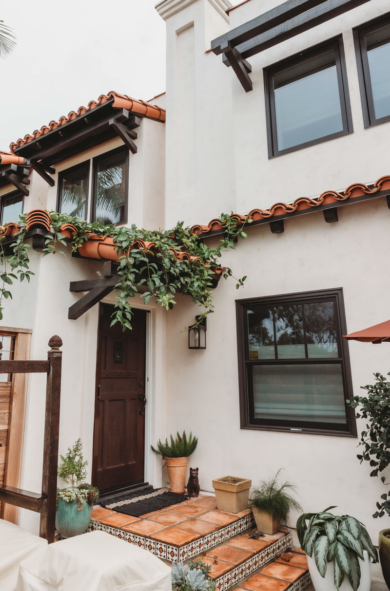
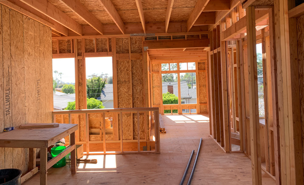
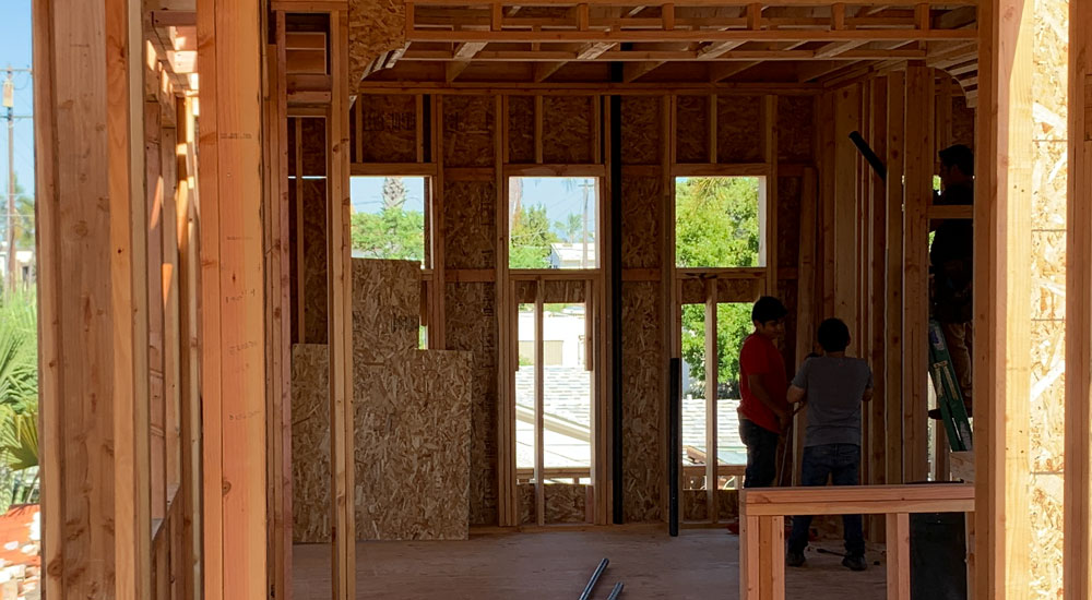
The before picture here is mid-project. We were tasked with helping to design a second-story addition to a small Spanish-style home. They wanted to add a main suite upstairs with many windows without looking too outdated or modern. The clean exterior designs helped make it possible for the clients to go in several directions for the interior design. Classic Montecito finishes on this home brought it all together.
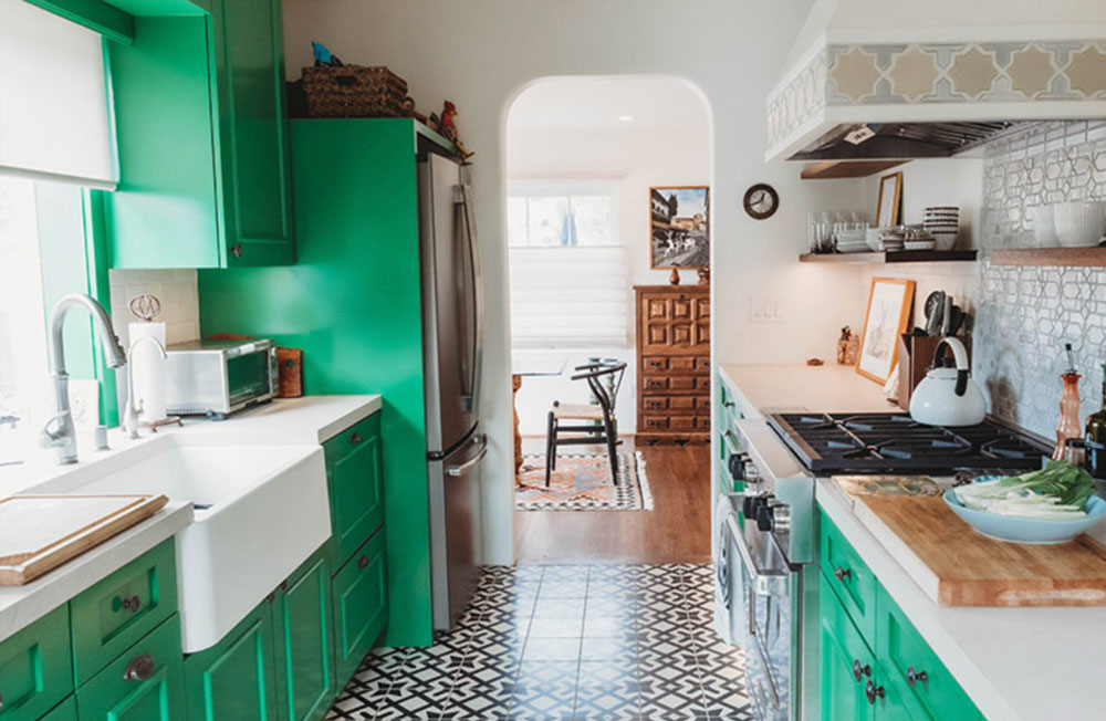
Kitchen
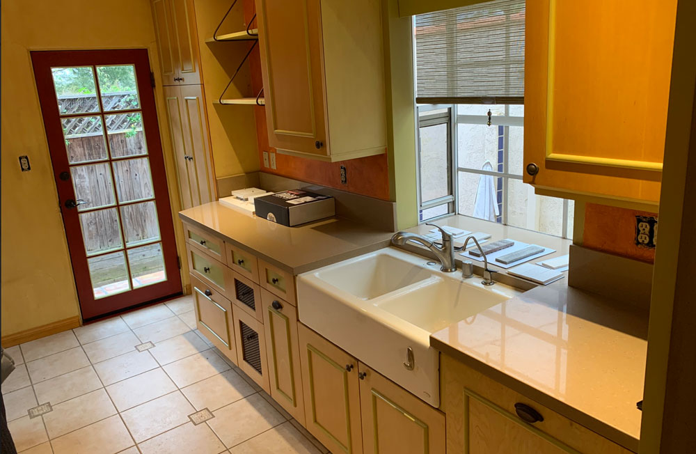
Client: “We have to have a colorful kitchen.” Us: “Well, we love color…so challenge accepted.” We loved bringing in a fun green color for the kitchen cabinets. The classic Spanish tiles on sections of the walls paired with a more modern tile on the floor made for a nice grouping of materials—perfect for the artistic clients living there!
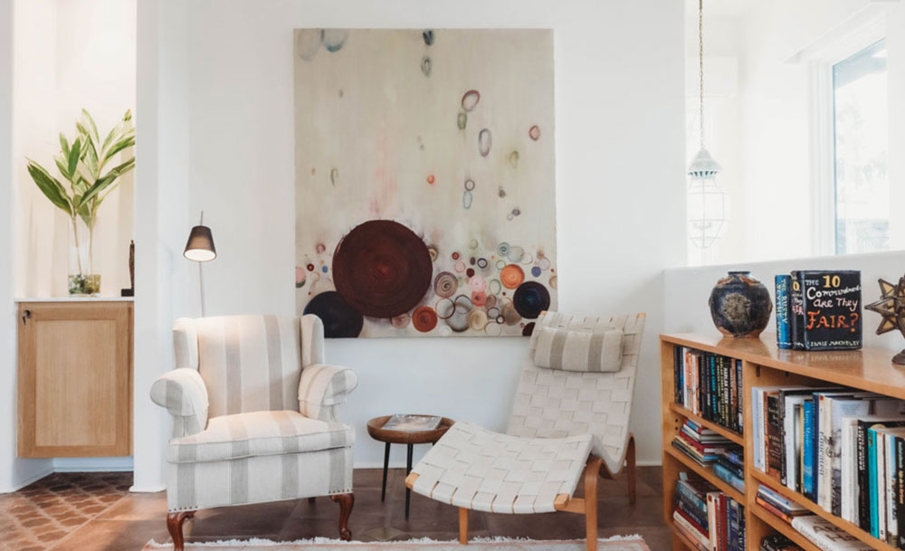
Master Bedroom
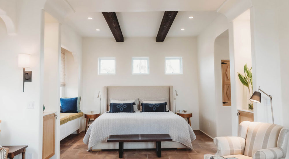
This was a second-story addition to a Spanish-style home. The client wanted a master suite on the entire second floor with a sitting area, fireplace, etc. We really wanted to create some really cool floor tile designs that we could layer in an eclectic mix of furniture styles. We also wanted it to be light and bright in there…so there were lots of windows and bright paints and finishes.
Rancho Sante Fe
Kitchen
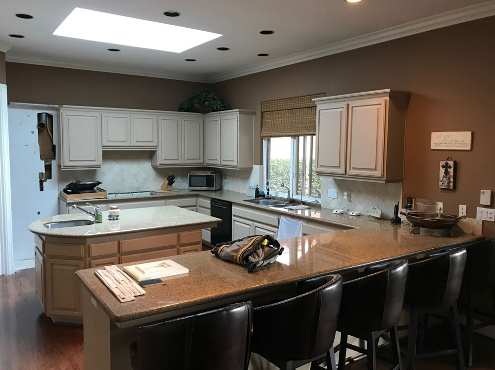
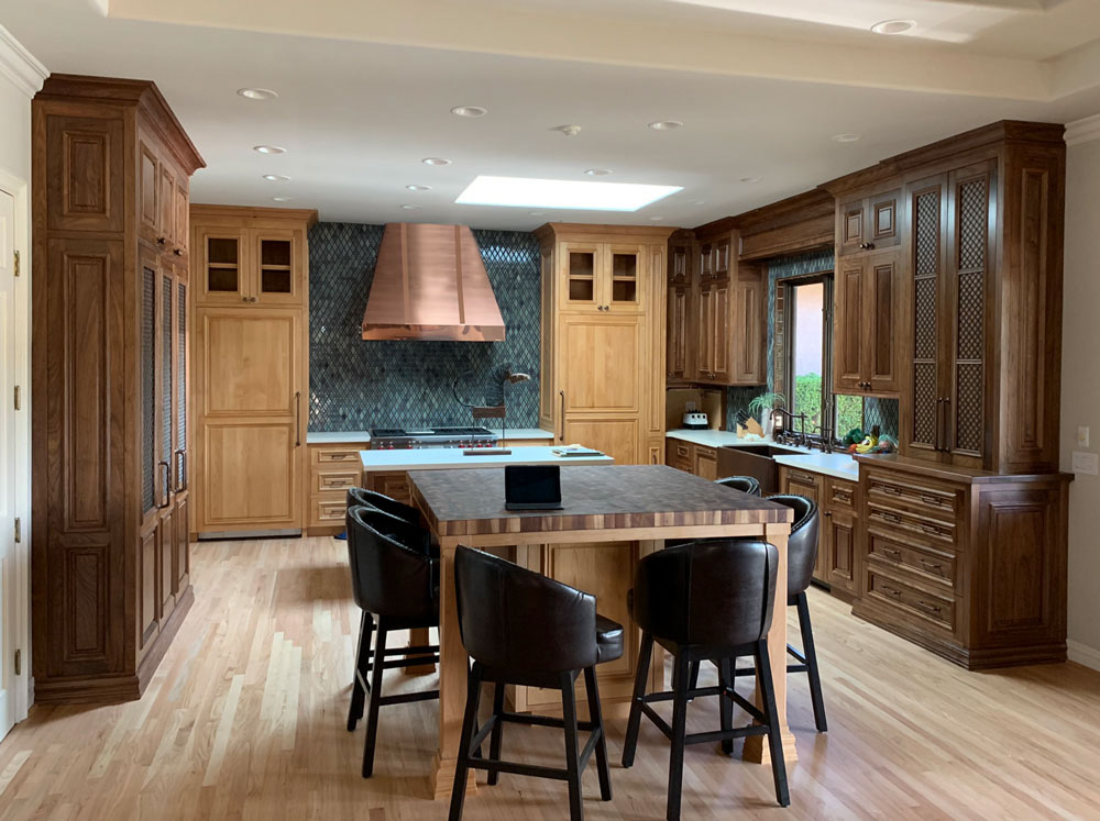
We don’t do many traditional homes, but we really dug into this one. The client had a large, ranch-style house with what looked like an old Ikea kitchen. This was like wearing a tux with flip-flops…just really out of place. They needed a kitchen that was appropriate for their house. We used the best wood materials, metalwork, tile selections, and custom countertops to elevate this space into its more natural state.
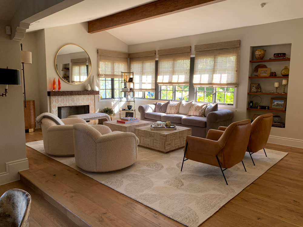
Living Room
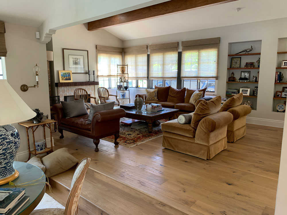
This was a home decorating project for a fashion designer who needed to update everything. She did have some great pieces that we repurposed with new fabrics, etc. We always like to keep the client’s furniture, art, etc., if we can fit them into the design direction, especially if they have sentimental value. This room became much more elegant with some fundamental design changes.

